How to Read an Uptime Report: What the Numbers Actually Mean
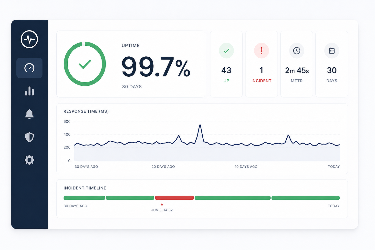
You open your monitoring dashboard, and there it is: 99.7% uptime. Sounds great, right?
Maybe. Maybe not. That number alone doesn't tell you whether you had one long outage or fifty short blips. It doesn't tell you if the downtime happened at 3 AM or during your biggest traffic spike of the month.
Uptime reports are full of useful data — but only if you know what to look at and what to ignore. Here's how to read one without getting lost in the numbers.
Uptime Percentage
This is the headline metric. It answers one question: what fraction of the monitoring period was your site reachable?
Here's what the common targets look like in practice:
- 99.9% (three nines): ~43 minutes of downtime per month
- 99.95%: ~22 minutes per month
- 99.99% (four nines): ~4 minutes per month
- 100%: Either genuinely perfect or your check interval is too long to catch short outages
The percentage is useful for SLA tracking and trend comparison, but it hides important context. A site with 99.5% uptime that had one 3-hour planned maintenance at 2 AM is in better shape than a site with 99.8% uptime that had fifteen random 1-minute outages during business hours.
What to do with it: Compare month over month. A steady 99.9% is healthy. A trend from 99.95% down to 99.7% over three months means something is degrading and needs attention.
Response Time
Response time measures how long your site takes to respond to each check. Most dashboards show an average, but the average alone can be misleading.
What actually matters:
- Average response time: The baseline. Under 500ms is solid for most sites.
- P95 / P99 response time: What the slowest 5% or 1% of requests look like. If your average is 200ms but your P95 is 4 seconds, your users are noticing.
- Trends over time: A response time chart that slowly creeps upward — even by 50ms per week — is an early warning sign. Your database is growing, a cache is filling up, or a third-party dependency is slowing down.
What to do with it: Set a slow response threshold. In Monitoristic, you can define what "slow" means for each monitor. When response times cross that line, you get alerted before it becomes an outage.
Incident Timeline
The incident timeline is where the real story lives. Each entry shows:
- When the outage started: The exact timestamp of the first failed check
- How long it lasted: Duration from first failure to confirmed recovery
- What happened: Status codes, timeout errors, DNS failures — the raw evidence
- When it was resolved: The timestamp of the first successful check after the outage
Patterns in the timeline tell you more than any single metric:
- Same time every day? Probably a cron job, backup, or deployment window
- Always the same duration? Could be an auto-scaling delay or a service restart cycle
- Clustered around deploys? Your deployment process needs a health check gate
- Random and unpredictable? Infrastructure instability — check your hosting provider's status history
What to do with it: Look at the last 30 days of incidents. If you see a pattern, that pattern is your highest-priority fix.
Check Interval and Its Effect on Data
Your check interval directly affects the accuracy of your report.
- 5-minute checks: Good for general awareness. You'll catch outages longer than 5 minutes reliably. Short blips (under 2 minutes) might be missed entirely.
- 2-minute checks: Catches most incidents. Good balance for production APIs and customer-facing sites.
- 1-minute checks: Near real-time detection. Essential for high-traffic or revenue-critical services.
A report based on 5-minute checks showing 100% uptime doesn't mean there were zero issues — it means there were no issues lasting longer than 5 minutes. If your check interval is longer than your typical outage duration, your report looks better than reality.
What to do with it: Match your check interval to how quickly you need to know about problems. Revenue-critical? Go with 1-minute or 2-minute checks.
What to Actually Do With Your Report
Reading the numbers is step one. Here's how to turn them into action:
- Set a baseline: Know your normal uptime percentage and average response time. You can't spot degradation if you don't know what healthy looks like.
- Review weekly: A quick weekly glance at your dashboard catches trends before they become incidents. Don't wait for an outage to look at your data.
- Share with your team: A public status page keeps your users informed. An internal review keeps your engineering team accountable.
- Focus on patterns, not individual events: One outage is an incident. The same outage three weeks in a row is a systemic problem.
- Use alerts, not dashboards: Dashboards are for review. Alerts are for action. If you're manually checking your dashboard to find out about downtime, your monitoring setup is incomplete.
The Report Is a Tool, Not a Score
It's tempting to treat uptime percentage as a grade. But 99.9% isn't an A+ — it's a data point. The value of an uptime report isn't the number at the top. It's the patterns it reveals, the incidents it documents, and the decisions it enables.
Read it regularly. Share it with your team. Act on what it tells you.
Want to understand what those uptime percentages really mean in practice? Our guide on uptime SLA explained breaks down the math behind 99.9% and what it costs when you fall short. And if your response time chart is creeping upward, read about the true cost of a slow website — slowness often hides behind a passing uptime check.
Not sure if your check interval is giving you accurate data? See how to choose the right check interval for your setup.